Data handling: Calculate, represent and interpret measures of central tendency and dispersion in univariate numerical grouped data
Unit 3: Constructing histograms
Natashia Bearam-Edmunds
Unit outcomes
By the end of this unit you will be able to:
- Construct a histogram.
- Interpret a histogram.
What you should know
Before you start this unit, make sure you can:
- recall the basics of representing data. You can revise the following subject outcomes in level 2, subject outcome 4.2.
Introduction
Histograms are often used to display grouped data. One advantage of a histogram is that it can easily be used for large data sets. In ‘real life’ applications we generally use a histogram when the data set consists of [latex]\scriptsize \displaystyle 100[/latex] values or more.
A histogram consists of rectangles drawn next to each other so that they touch. The horizontal axis shows what the data represents, for example, distance. The vertical axis shows either frequency or relative frequency. In this unit and for your purposes you will only need to plot frequency graphs and not relative frequency. The histogram shows the shape of the data, the centre and the spread of the data.
Constructing a histogram
If you are not given a frequency distribution you can construct a histogram as shown in the following example.
Example 3.1
Create a histogram for the number of books bought by [latex]\scriptsize 50[/latex] part-time college learners.
[latex]\scriptsize \displaystyle \begin{align*}&1;\text{ }1;\text{ }1;\text{ }1;\text{ }1;\text{ }1;\text{ }1;\text{ }1;\text{ }1;\text{ }1;\text{ }1\\&2;\text{ }2;\text{ }2;\text{ }2;\text{ }2;\text{ }2;\text{ }2;\text{ }2;\text{ }2;\text{ }2\\&3;\text{ }3;\text{ }3;\text{ }3;\text{ }3;\text{ }3;\text{ }3;\text{ }3;\text{ }3;\text{ }3;\text{ }3;\text{ }3;\text{ }3;\text{ }3;\text{ }3;\text{ }3\\&4;\text{ }4;\text{ }4;\text{ }4;\text{ }4;\text{ }4\\&5;\text{ }5;\text{ }5;\text{ }5;\text{ }5\\&6;\text{ }6\end{align*}[/latex]
Solution
Note that ‘number of books’ is discrete data, since books are counted.
To draw the histogram you must decide how many bars or intervals, also called classes, represent the data.
Calculate the number of bars as follows: [latex]\scriptsize \displaystyle \displaystyle \frac{{\text{largest value}-\text{smallest value}}}{{\text{number of bars}}}=\text{width of bar/interval}[/latex].
Before you can calculate the number of bars you must choose a starting point for the first interval to be less than the smallest data value.
With discrete data, all the data values happen to be integers. In this example the smallest value is [latex]\scriptsize 1[/latex], so a convenient starting point will be [latex]\scriptsize 1-0.5=0.5[/latex]. The largest value is [latex]\scriptsize 6[/latex] so we add [latex]\scriptsize 0.5[/latex] to [latex]\scriptsize 6[/latex] to get the end point of [latex]\scriptsize 6.5[/latex].
Next, calculate the width of each bar or class interval. If the data are discrete and there are not too many different values, a width that places the data values in the middle of the bar is the most convenient.
Since the data consist of the numbers [latex]\scriptsize \displaystyle 1;\text{ }2;\text{ }3;\text{ }4;\text{ }5;\text{ }6[/latex] and the starting point is [latex]\scriptsize 0.5[/latex], a width of one places the [latex]\scriptsize 1[/latex] in the middle of the interval from [latex]\scriptsize 0.5[/latex]to [latex]\scriptsize 1.5[/latex], the [latex]\scriptsize 2[/latex] in the middle of the interval from [latex]\scriptsize 1.5[/latex] to [latex]\scriptsize 2.5[/latex], and so on.
Therefore, [latex]\scriptsize \displaystyle \frac{{6.5-0.5}}{\text{number of bars}}=1[/latex] so the number of bars is [latex]\scriptsize 6[/latex].
| Intervals | Frequency |
| [latex]\scriptsize 0.5 \lt x\le 1.5[/latex] | [latex]\scriptsize 11[/latex] |
| [latex]\scriptsize 1.5 \lt x\le 2.5[/latex] | [latex]\scriptsize 10[/latex] |
| [latex]\scriptsize 2.5 \lt x\le 3.5[/latex] | [latex]\scriptsize 16[/latex] |
| [latex]\scriptsize 3.5 \lt x\le 4.5[/latex] | [latex]\scriptsize 6[/latex] |
| [latex]\scriptsize 4.5 \lt x\le 5.5[/latex] | [latex]\scriptsize 5[/latex] |
| [latex]\scriptsize 5.5 \lt x\le 6.5[/latex] | [latex]\scriptsize 2[/latex] |
The histogram displays the number of books on the x-axis and the frequency on the y-axis.
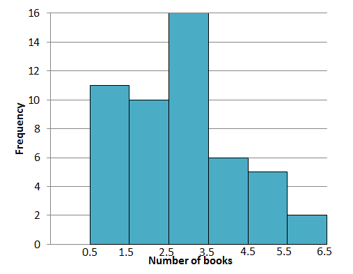
The height of the bars gives the frequency of each interval and the intervals are listed on the x-axis. Now that you’ve drawn the histogram, you get a better overall picture of the data because you can visualise it. We can also see at a glance some important things that the data reveals.
The tallest bar shows that [latex]\scriptsize 3[/latex] books was the most popular observation, with a frequency of [latex]\scriptsize 16[/latex].
Take note!
At this maths level, the interval width will be given in exam questions.
Histograms are often used to display continuous data. You will recall that this is data that can be measured. The next example uses continuous data to construct a histogram.
Example 3.2
The following data represent the heights of [latex]\scriptsize \displaystyle 16[/latex] people, in centimetres.
[latex]\scriptsize \displaystyle 162\text{ };\text{ }168\text{ };\text{ }177\text{ };\text{ }147\text{ };\text{ }189\text{ };\text{ }171\text{ };\text{ }173\text{ };\text{ }168;\text{ }178\text{ };\text{ }184\text{ };\text{ }165\text{ };\text{ }173\text{ };\text{ }179\text{ };\text{ }166\text{ };\text{ }168\text{ };\text{ }165[/latex]
Use class intervals that start at [latex]\scriptsize \displaystyle 140\text{ cm}[/latex] and end at [latex]\scriptsize \displaystyle 190\text{ cm}[/latex] to draw a histogram.
Solution
Step 1: Determine intervals
We need intervals of the same length between [latex]\scriptsize \displaystyle 140\text{ cm}[/latex] and [latex]\scriptsize \displaystyle 190\text{ cm}[/latex] so we could go up by [latex]\scriptsize \displaystyle 10[/latex] centimetres each time. Calculate the number of intervals, which corresponds to the number of bars, using:
[latex]\scriptsize \displaystyle \displaystyle \frac{{\text{largest value}-\text{smallest value}}}{{\text{number of bars}}}=\text{width of bar/interval}[/latex]
[latex]\scriptsize \displaystyle \begin{align*}\displaystyle \frac{{190-140}}{{\text{number of bars}}}&=10\\10\times \text{number of bars}&=50\\\therefore \text{number of bars}&=5\end{align*}[/latex]
Note: If you know how many bars you’d like to use you can use the method above to calculate the bar width.
We can use round and square brackets to show which values are excluded and included in the intervals. Round brackets are used to show values that are not included and square brackets are used to show included values. Interval [latex]\scriptsize (140;150][/latex] means all values greater than [latex]\scriptsize 140\text{ cm}[/latex]and less than or equal to [latex]\scriptsize 150\text{ cm}[/latex].
| Intervals |
| [latex]\scriptsize (140;150][/latex] |
| [latex]\scriptsize (150;160][/latex] |
| [latex]\scriptsize (160;170][/latex] |
| [latex]\scriptsize (170;180][/latex] |
| [latex]\scriptsize (180;190][/latex] |
Step 2: Include the frequency in each interval
The following frequency table summarises the number of data values in each of the intervals.
| Intervals | Frequency |
| [latex]\scriptsize (140;150][/latex] | [latex]\scriptsize 1[/latex] |
| [latex]\scriptsize (150;160][/latex] | [latex]\scriptsize 0[/latex] |
| [latex]\scriptsize (160;170][/latex] | [latex]\scriptsize 7[/latex] |
| [latex]\scriptsize (170;180][/latex] | [latex]\scriptsize 6[/latex] |
| [latex]\scriptsize (180;190][/latex] | [latex]\scriptsize 2[/latex] |
Step 3: Draw the histogram
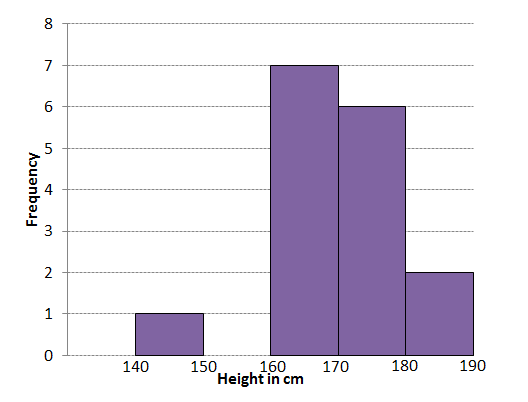
The interval [latex]\scriptsize (150;160][/latex] has no entries so we do not draw a bar in that interval.
Exercise 3.1
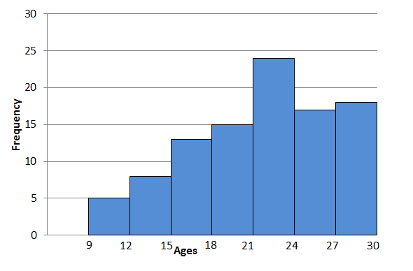
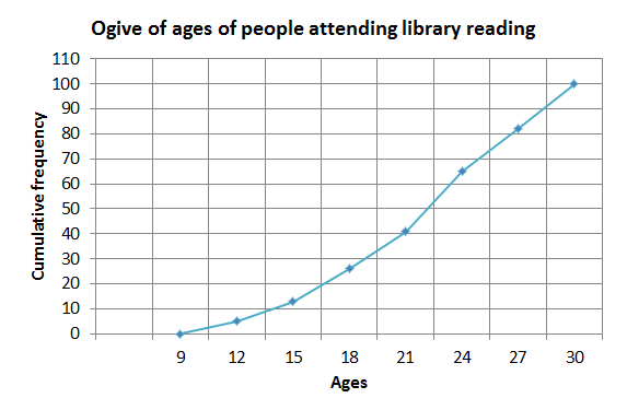
- Below is the cumulative frequency table of the ages of people attending a public reading by an author at a library.
Class intervals Frequency Cumulative frequency [latex]\scriptsize 9 \lt x\le 12[/latex] [latex]\scriptsize \displaystyle 5[/latex] [latex]\scriptsize \displaystyle 5[/latex] [latex]\scriptsize 12 \lt x\le 15[/latex] [latex]\scriptsize \displaystyle 8[/latex] [latex]\scriptsize \displaystyle 13[/latex] [latex]\scriptsize 15 \lt x\le 18[/latex] [latex]\scriptsize \displaystyle 13[/latex] [latex]\scriptsize \displaystyle 26[/latex] [latex]\scriptsize 18 \lt x\le 21[/latex] [latex]\scriptsize \displaystyle 15[/latex] [latex]\scriptsize \displaystyle 41[/latex] [latex]\scriptsize 21 \lt x\le 24[/latex] [latex]\scriptsize \displaystyle 24[/latex] [latex]\scriptsize \displaystyle 65[/latex] [latex]\scriptsize 24 \lt x\le 27[/latex] [latex]\scriptsize \displaystyle 17[/latex] [latex]\scriptsize \displaystyle 82[/latex] [latex]\scriptsize 27 \lt x\le 30[/latex] [latex]\scriptsize \displaystyle 18[/latex] [latex]\scriptsize \displaystyle 100[/latex] Use the table to construct:
- a histogram.
- an ogive.
- The following data represent the number of employees at various restaurants. Use this data to create a histogram.
[latex]\scriptsize \displaystyle 22;\text{ }35;\text{ }15;\text{ }26;\text{ }40;\text{ }28;\text{ }18;\text{ }20;\text{ }25;\text{ }34;\text{ }39;\text{ }42;\text{ }24;\text{ }22;\text{ }19;\text{ }27;\text{ }22;\text{ }34;\text{ }40;\text{ }20;\text{ }38;\text{ }28[/latex]
.
Use [latex]\scriptsize 10 \lt x\le 19[/latex] as the first interval.
The full solutions are at the end of the unit.
Interpreting histograms
The shape of a histogram can tell you a lot about the distribution of the data and gives information about the mean, median and mode of the data set. The most common shapes of histograms are symmetric and skewed.
You will recall that the mean is the measure of central tendency that is highly influenced by extreme values. So, by looking at the position of the mean in relation to the median you can tell if a graph is skewed or symmetric.
A symmetric histogram is more or less identical on both sides of the mean.
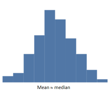
For symmetric distributions, the mean is approximately equal to the median and the left and right tails are equally balanced, meaning that they have about the same length.
In a skewed histogram the data seems to extend more to one side than the other. We say the tail is longer on the one side than the tail on the other side. There are two types of skewedness:
- Skewed right (positive)
A histogram skewed to the right has a longer tail on the right side.
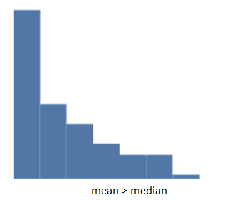
For positively skewed data the mean [latex]\scriptsize \gt[/latex]median. If there are extreme values towards the positive end of a distribution, these will increase the value of the mean. - Skewed left (negative)
A histogram skewed to the left has a longer tail on the left side.
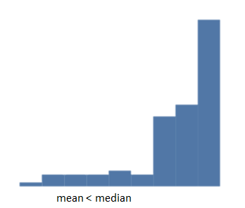
For negatively skewed data, you will notice that mean [latex]\scriptsize \lt[/latex]median. This is due to the presence of extreme lower values to the left (or negative) side of the distribution that will decrease the value of the mean.
Note
Watch this video called “Classifying shapes of distributions” for a summary of types of histograms.
Example 3.3
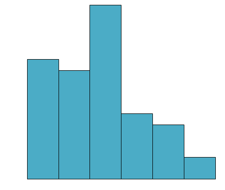
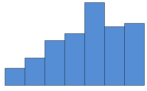
Which box-and-whisker plot represents the shape of the histogram below?
Solution
The histogram has a longer tail on the right so it is positively skewed, which shows that the mean is greater than the median.
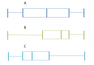
Box plot A: The median is in the middle of the box, and the whiskers are about the same length on either side of the box so the distribution is symmetric or normal.
Box plot B: The median is pulled towards the upper quartile, and the whisker is shorter on the upper end of the box so the distribution is negatively skewed (skewed left).
Box plot C: The median is pulled towards the lower quartile, and the whisker is shorter on the lower end of the box so the distribution is positively skewed (skewed right).
Therefore, box plot C is a possible representation of the histogram in this example.
Exercise 3.2
- State whether the following data sets are symmetric, skewed right or skewed left and comment on the position of the mean in relation to the median.
- A data set with this box-and whisker plot:
- A data set with this histogram:
- A data set with this box-and whisker plot:
- If the mean [latex]\scriptsize \gt[/latex]median[latex]\scriptsize \gt[/latex]mode will the graph skew to the right or left?
- The heights of learners in a college are recorded and are shown in the histogram below:
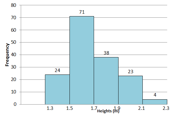
- How many heights were recorded?
- What was the most common interval of recorded heights?
- Comment on the shape of the distribution. What is the cause of this?
The full solutions are at the end of the unit.
Summary
In this unit you have learnt the following:
- How to construct a histogram from discrete data.
- How to construct a histogram from a frequency distribution.
- How to interpret the shape of a histogram.
Unit 3: Assessment
Suggested time to complete: 25 minutes
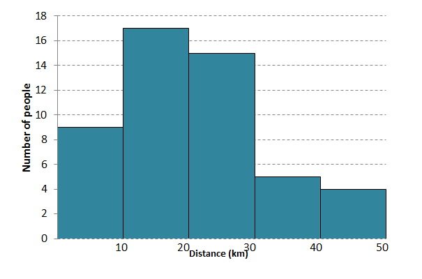
- In a traffic survey a random sample of [latex]\scriptsize \displaystyle 50[/latex] motorists were asked what distance they drove to work daily. The results of the survey are shown in kilometres in the table below. Draw a histogram to represent the data.
Distance [latex]\scriptsize 0 \lt d\le 10[/latex] [latex]\scriptsize 10 \lt d\le 20[/latex] [latex]\scriptsize 20 \lt d\le 30[/latex] [latex]\scriptsize 30 \lt d\le 40[/latex] [latex]\scriptsize 40 \lt d\le 50[/latex] f [latex]\scriptsize 9[/latex] [latex]\scriptsize 17[/latex] [latex]\scriptsize 15[/latex] [latex]\scriptsize 5[/latex] [latex]\scriptsize 4[/latex] - The histogram below shows the number of hours learners in a class spent playing video games over a weekend.
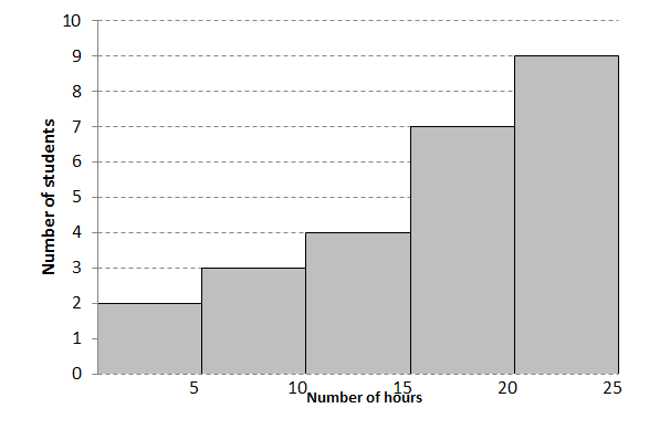
- How many learners were in the survey?
- What was the maximum number of hours spent playing video games?
- How many learners spent [latex]\scriptsize 10[/latex] or less hours playing video games?
- How many learners spent more than [latex]\scriptsize 15[/latex] hours playing video games?
- How many hours did most learners spend playing video games?
- Comment on the shape of the histogram.
The full solutions are at the end of the unit.
Unit 3: Solutions
Exercise 3.1
- .
- The histogram
- The ogive
- The histogram
- Draw a frequency table first to make it easier to draw the histogram.
Intervals Frequency [latex]\scriptsize 10 \lt x\le 19[/latex] [latex]\scriptsize 3[/latex] [latex]\scriptsize 19 \lt x\le 28[/latex] [latex]\scriptsize 11[/latex] [latex]\scriptsize 28 \lt x\le 37[/latex] [latex]\scriptsize 3[/latex] [latex]\scriptsize 37 \lt x\le 46[/latex] [latex]\scriptsize 5[/latex] 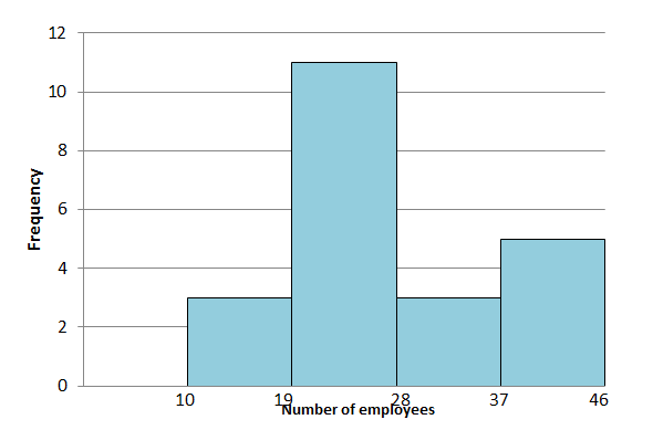
Exercise 3.2
- .
- Symmetric box-and-whisker plot with mean approximately equal to the median.
- Negatively skewed histogram with mean less than the median.
- Positively skewed data (skewed to the right) since the mean [latex]\scriptsize \gt[/latex]median[latex]\scriptsize \gt[/latex] mode.
- .
- Adding the height of the bars you get [latex]\scriptsize \displaystyle 160[/latex] observations.
- Most heights were in the [latex]\scriptsize \displaystyle 1.5\text{ m}[/latex] to [latex]\scriptsize \displaystyle 1.7\text{ m}[/latex] interval as this is shown as the tallest bar.
- The shape of the histogram indicates that the data are skewed to the right. This is due to a few very tall people with a height of over [latex]\scriptsize 2.1\text{ m}[/latex].
Unit 3: Assessment
- .
- .
- By adding the height of the bars together you will calculate that [latex]\scriptsize 25[/latex] learners made up the survey.
- [latex]\scriptsize 25[/latex] hours
- [latex]\scriptsize 5[/latex] learners
- [latex]\scriptsize 16[/latex] learners
- Most learners spent [latex]\scriptsize 20[/latex] to [latex]\scriptsize 25[/latex] hours playing video games.
- The histogram is negatively skewed (it has a longer tail on the left).
Media Attributions
- Histogram 1 Example 3.1 © DHET is licensed under a CC BY (Attribution) license
- Histo 2 Ex 3.2 © DHET is licensed under a CC BY (Attribution) license
- Histo 5 symmetric © DHET is licensed under a CC BY (Attribution) license
- Histo 6 Skewed right © DHET is licensed under a CC BY (Attribution) license
- Histo 7 Skewed left © DHET is licensed under a CC BY (Attribution) license
- Histo 8 Example 3.3 © DHET is licensed under a CC BY (Attribution) license
- Fig 9 Example 3.3 © DHET is licensed under a CC BY (Attribution) license
- Fig 10 Exercise 3.2 Q1a © DHET is licensed under a CC BY (Attribution) license
- Fig 10 Exercise 3.2 Q1b © DHET is licensed under a CC BY (Attribution) license
- Graph 11 Exercise 3.2 Q3 © DHET is licensed under a CC BY (Attribution) license
- Graph 12 Assess Q 2 © DHET is licensed under a CC BY (Attribution) license
- Histo 3 Exercise 3.1 Q1 © DHET is licensed under a CC BY (Attribution) license
- Exercise 3.1 Q1b © DHET is licensed under a CC BY (Attribution) license
- Histo 4 Exercise 3.1 Q2 Answ © DHET is licensed under a CC BY (Attribution) license
- Graph 13 Assess Q1 Ans © DHET is licensed under a CC BY (Attribution) license
